Tuesday, 2 May 2017
Goodbye
Hello everyone I am glad to say I have finally completed my project. It was a real pleasure doing this from all the way in the start of the year till now and I want to thank you for reading my blogs and as you can see from them I've developed my skills as the days and weeks went on and this wouldn't have happened without this course so once again thank you and I hope you enjoyed my blog 😃
What have you learnt about technologies from the process of constructing this product?
While constructing this product I've encountered variety of different technologies. Below you'll find how the technologies were used with the images of them.
Apple Mac:


Apple Mac:

I've never used the Mac before so I had to learn key components about it. I used Adobe Photoshop to edit pictures and to create the front cover and the contents page of my magazine and for my double page spread I used Indesign. Finally I also used Adobe Premier Pro to edit some videos which have been included in my Blog.
Iphone 6S:

I also used my phone for the creation of my music magazine. This is because I recorded feedbacks from people about my magazine and to take photos of the flat plans we've created which then I had to upload onto to my Mac.
Canon Camera:

Finally I also had to use a professional camera to take photos which will be included in my magazines front cover, contents page and double page spread. However I had to learn how to use it properly as I haven't used one before.
How did you attract/address your audience?
I attracted my audience by having real recognisable artist names on my front cover as like this people will know about some of the artists and could be more interested to see how they feature on my magazine. I've also included real issues such as artists versing each other in the front cover of my magazine. I thought this would be good as it could make my audience engaged wanting to know more about the issues and buy the magazine as a result!
What kind of media institution might distribute your media product and why?
I believe the best media institution that will distribute my product (Magazine) is Bauer Media Group. This is because they're the biggest magazine publisher in the U.K and have been involved in the industry since 1953. As my magazine has potential and them being the leaders in the industry I believe they will be the best magazine to distribute my magazine because with their help my magazine could go into the right hand (Target Market)
Monday, 1 May 2017
Double Page Spread 3 (After feedback)

This is my final update for my double page spread after the feedback of my peers. I have changed quite a bit as from my feedback and looking at it carefully I didn't quite like it. First thing I done was enlarge my picture and made it fill the entire page and put the pull quote underneath so that side of the page was not empty. Also for the Main Pull quote I changed the way I put it and put it across two pages which made it look more sharp. The background colour was changed as you can notice and put red background for the Main Pull quote and the introduction as it makes the text stand out more. Finally I added a bottom strip and included the Masthead, Date and the website.
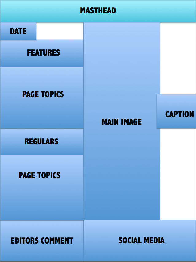
Content Page Update 3 (After feedback)

This is my last update for my contents page and as you can see it's finished! I changed the font from the last update as I felt like it didn't suit the page too well. I added a editors letter as every professional magazine seems to have included it in their contents page so I felt like it'll only be right if I do too. Finally social media links were added as I felt like there was a gap up there which I had to fit.
Front Cover Update 4 (After peer feedback)

Hello everyone this will be last update on my front cover as I feel like I've finished. As you can see there's lots of changes. First of all I added the cost and the date of my magazine on the bottom left hand corner along with the bottom strip as I felt the bottom side of my magazine was left empty. Then I added some FX to ''Exclusive Interview'' as it was hard to read. As you see I've added 'The Top 50 hottest tracks of the year as my issue was published in December and I felt like it would be a good feature to include as it's relatable to the season it's issued on.
Sunday, 30 April 2017
Feedback


Hello everyone today I have got feedback from my peers for my front cover, contents page and double page spread. I'll update you guys as I update some of my work from the feedback I've got.
See you soon!
Saturday, 29 April 2017
Double Page Spread Update 2
Hello everyone this is my latest double page spread update. I have decided to include the red background onto the white introduction as it fits in well and also added the page numbers, website and the masthead at the bottom of the double page spread which I was planning to do from my last update.

Double Page Spread Update 1

Today I've started my double page spread and I have prewritten the interview with my cover star which helped me out a lot as I didn't have much to write. I put the pull quote as Stormy with that text as I felt like it made my double page spread seem neat. In my next update I'm planning to include a background colour and the page numbers, masthead and website at the bottom of my double page spread.
Tuesday, 25 April 2017


Friday, 21 April 2017
Contents Page Update 2

As you can see today I done big updates for my contents page. I changed the background colour from black to red as I found black too 'Dull' and felt like white font on a red background will be more eye catching. In addition to that I also added some regulars and also the image that I will be using for my contents page.
Friday, 17 March 2017
Contents Page Update 1

Today I've started on my contents page and I've included the page numbers and the background colour and as you can see there's not that many stuff left on it and I will soon add the title for each pages and the image.
Friday, 10 March 2017


Wednesday, 8 March 2017


Tuesday, 28 February 2017
Front Cover Update 3

Hello everyone I'm back with more improvements to my front cover. I added more cover-lines and added the promotion on the front cover of the magazine at a high location so it could be spotted by people and hopefully make them more likely to buy the magazine.
Wednesday, 22 February 2017
Front Cover Update 2

This is my second magazine update and I decided to change the background as it seemed too lame with the white background and didn't suit the conventions. In addition to that I changed my masthead and added white edges as I feel like it made it eye catching. Finally I added a barcode in the bottom right hand corner so it looks more professional!
Wednesday, 15 February 2017
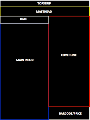
Front Cover Update 1

Hello everyone this is my first day of starting my front cover as you can see it's in early stages I will update you as I progress more. Hope to see you soon1
Monday, 13 February 2017
Photoshoot pictures
Hello everyone I thought it'll be good presenting you some of the photos which was taken today which could potentially be used (as there's lots of photos so it's going to be tricky picking one).


Saturday, 11 February 2017
Photoshoot ideas
Hello everyone today I've researched some ideas for the upcoming photoshoot for my magazine which I thought I'll share it with you.

Wednesday, 8 February 2017
Flat Plan 3x (Front Cover)
Below you can find the Flat Plan's I've created for my music magazine. I've created three to give me a rough idea of how I want to set up my front cover for my upcoming magazine!


Friday, 27 January 2017
Cover Star Identity
Diamond R

Today I'll be presenting you my cover star for my magazine, Diamond R. He is aged 21 and was born in Croydon, South London. He first released his song when he was 14 and like that he gained attention and made people talk about him locally . However, it all changed when he dropped his first mixtape around the age of 16 and the as a result he was known nationwide and when he was 17 Drake invited him to his Gig and made him go on stage with him which is why now he's known all around the world. He is now producing an album with both Drake and Young Thug and is described as 'one of the most upcoming artist'.
Friday, 20 January 2017
Weekly Update
Hello everyone another week has gone by and we're getting closer to the start of the creation of my magazine. This week I managed two focus on my colour scheme and Masthead for my magazine. I created the colour scheme that I'll be using in my magazine and done this by going on the website called 'https://coolors.co' and I presented you how I ended up with my colour scheme and my actual colour scheme. After that I decided what my masthead will be and the font I'll be using and posted you my reasoning for it and then decided the colour the Masthead will be.
Next week I'll be showing you my Cover star, magazine pitch and my Flat plan for my front cover, double page spread and contents page. Hope you enjoy your week and hope to see you here again same time next week.
Next week I'll be showing you my Cover star, magazine pitch and my Flat plan for my front cover, double page spread and contents page. Hope you enjoy your week and hope to see you here again same time next week.
Masthead Colour (Actual)

Hello everyone as you can see I've finally decided my Masthead colour that I'll use on my magazine. The reason for me picking red is that I feel like because it's a bright colour that's eye-catching it'll help me reach my target audience more easily. Also the colour Red connotes Danger and Blood and as Hip-Hop is a serious genre. For this reason I believe it'll be easier for my target audience to spot it's a Hip-Hop magazine. For example a Pop magazine's masthead being red will be rare as the colour Red doesn't connote what Pop stands for so you're more likely to see Pink on a pop magazine.
Masthead Colour (Potential ones)

Hello everyone here's the four colours that I've chosen that can be used for my masthead. I've tried to relate this to the colour scheme I've chosen for my music magazine but I couldn't include the white as it clashes and you can't see it properly. In my next post I'll be letting you know which one I decided to go with.
Final Masthead

Wednesday, 18 January 2017
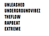
Masthead Design
Hello everyone today I'll be presenting you the designs of my five potential Mastheads for my music magazine. I'll be posting my final Masthead that I have chosen with the font soon and will be explaining my reasoning for it in another blog post.


Colour Scheme (Actual)

Hello people as you might remember from last weeks weekly update I said that I'll be creating a colour scheme for my Hip-Hop magazine and I've decided to go with this one. The reason for this is that the colour white and black I think is necessary as most Hip-Hop magazines contain it and also they both contrast well together. As you can see I've also included the colour Pale Silver in my colour scheme as I felt that it's a 'smooth' colour. I also included Red in my colour scheme as when I was looking as it's considered as a Dark and serious colour so by including this it makes it stand out more compared to other magazines. Finally I used the colour Purple in my colour scheme as I feel like it'll be unique as the colour Purple is not generally used in Hip-Hop magazines and also it contrasts well with other colours in my scheme too.
Tuesday, 17 January 2017
Colour Scheme (How I got I ended up with scheme)
Hello everyone today I'll be showing you how I ended up with my final colour scheme. I ended up creating my colour scheme on a website called 'Coolors' and had to go through different stages until I came to my final colour scheme and you can find the stages below with explanations of the colours I decided to keep and get rid off. You'll be able to find my final colour scheme in my next post.


Friday, 6 January 2017
Weekly Update
Hope you're all doing fine as today I'm going to go through my weekly work with all of you guys. This week I've managed to complete my Front Cover, Contents Page and Double Page spread mood board and also I've analysed the front cover of two Hip-Hop magazines. I found the mood board tasks quite interesting as I managed to see different designs that I've liked for the front cover, Contents Page and Double Page spread and it helped me get a rough idea on how I can set my own magazine. Remember if you'll like to see the designs that I have pinned on more detail you can click on the link for them (Front cover, Contents Page and Double page spread). Final task I did this week was to analyse the front cover of two Hip-Hop magazines (As my magazine will be based on Hip-Hop). This benefited me as I looked in depth in different parts of the magazine and was able to spot why the front cover was suitable for a Hip-Hop magazine.
That's all of that for this week but next week I'll be able to show you my Colour Scheme for my magazine and also my Masthead designs so hopefully I'll get to see you all next week!
That's all of that for this week but next week I'll be able to show you my Colour Scheme for my magazine and also my Masthead designs so hopefully I'll get to see you all next week!
Analysis of 2 music magazine of the same genre as mine (Hip-Hop)


As you can see both of the magazines Mastheads have both red and white wether it's on the actual font or background. This is very useful for both Vibe and XXL as it makes their Mastheads stand out which makes it easier for people to recognise as the colour Red and White have a good combination and is suitable for the magazine. In addition to that both of their Mastheads are in Bold which helps the Genre as Hip-Hop is known to be a 'serious' genre by having it in Bold this makes it more appropriate for the magazine.
On both magazines the main image contains someone recognisable in the Hip-Hop genre which is the case for nearly most Hip-Hop magazines. This is beneficial as both Kendrick Lamar and Dr.Dre attracts people to buy the magazine as they're well known in the industry and people who like Hip-Hop would like to get to know them more. Also in both of the images you can see that the artists have a 'bad boy' expressions as they both look serious this like the masthead is very suitable for the Hip-Hop magazine as I've said before Hip-Hop is considered to be serious and by both of the artists looking like a 'bad boy' it links to the genre of the magazine.
Finally as you can see both of the cover-lines on the magazines use the same kind of structure. On both of them they try to make the name of the person on the main image stand out by having their name eye catching to the reader by making the font size large. They both have simplicity on the front cover everything seems to be organised and neat. On both of the magazines the cover-lines are on the right side of the magazine and is a list on what is included in the magazine but nothing that goes into detail which is one of the reasons why the front cover looks neat and simple. Also they've both also ensured that no cover-lines get in the way of the image and as a result have left the bottom half of the front cover empty so the image stand out to the audience.
Subscribe to:
Posts (Atom)