Wednesday 30 November 2016

Analysis of music magazine (Hip-Hop&Rock)


Image result for rock magazineImage result for hip hop magazine covers


Analysis of the magazines
Today I'll be analysing two different genres of music magazine - Hip-Hop and Rock. As you can see from the images above you can instantly tell they're different. The Hip-Hop magazine has more of a brighter approach and uses the colour red as the background whereas the rock magazine uses the colour black. The Hip-Hop one for this reason more eye catching as red is more appealing to the eye than black as you can see above. Both of their Mastheads are behind the main image however the Hip-Hop one seems be more covered. One of the reasons for this could be that 50 Cent's face is focused is in the cover and by having him there you straight away can tell it's going to be about Hip-Hop as he's a massive artist and also in the middle of the page it even mentions him so if you don't know about Hip-Hop it does say. On the other hand the rock magazines image doesn't cover whole of the magazine and it focuses on the whole body of the person instead of focusing on the face this could be because the person ain't a popular figure so it would not be a good selling point. Also on the rock magazine you can see that the photo has a electronic guitar on it which also helps it stand out more as a rock magazine as electronic guitars are one of the main instruments in rock. Finally the rock magazine seems to be more neat and organised as all the cover-lines are placed in an ordinarily fashioned and keeps it simple whereas the Hip-Hop magazine has cover-lines going down from the right hand side and also have images on the left hand side and seem less organised than the rock magazine. Overall I believe both magazines are good for their genres as they both suit the individual genre and Hip-Hop and rock is seen as genres that are not similar to each other which reflects by the magazines as you can see they're not similar in any kind of way.


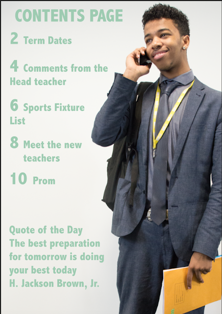
Frankenstien (Contents Page)

As I mentioned on my last post I said I'll be showing you both my front cover (last post) and my content page frankenstein which you can find below this text as an image


Tuesday 29 November 2016

Frankenstein (Front cover)


Hello everyone, today I'll be presenting both of my Frankensteins that I've created a (Front cover and contents page) and show you my analysis of them. In this post I'll be showing you my frankenstien for my front cover with the analysis of it.


Monday 28 November 2016

Weekly Update

Hello everyone I hope you're having an amazing day. Today I've finally completed my preliminary task of my school magazine and have a completed front cover and contents page. I really enjoyed the creation of my magazine as I managed to improve on my photoshop skills. When I tried to do my front cover I was struggling at first as I lacked experience however as I slowly got used to it and played about I managed to do my front cover and by doing this task I managed to improve on my photoshop skills. In addition to that I've also managed to get audience feedback about my magazine so I know where to improve next time and to avoid mistakes I've already done which I found really helpful. Finally just to give you guys a heads up I will be now focusing on my music magazine and will be showing you some updates in the coming days.

Hope you enjoy your week.

School Magazine front cover & contents page analysis

Hello everyone I can confirm that I have finally finished my front cover and contents page for my school magazine and will be going through it with you.

Front Cover
My front cover was a task which I found the most difficult to make. The reason for this was the lack of experience in Photoshop however I managed to overcome it as I slowly got used to it. I added the blue background as the colour blue connotes intelligence which suits my magazine as 6th former's are seen as intelligent and formal which is suitable for my magazine. I've chosen the image of the two students and ensure that they wore suits as they looked smart which is what you want the 6th former's to look like and also by them focusing on the camera with a serious look it made them look more like grown ups that are ready for the challenge which is what you want your 6th former's mind set to be like. Finally I also added 'Guide for each topic for 6th former's' as I believed this would attract people to get the magazine as my magazine date shows it's early in the academic year which will be useful for them and be a good selling point. Overall I enjoyed creating my front cover for my magazine as I managed to learn new stuff in Photoshop and it was similar to what I planned it to be which I was happy about.

Contents Page
I believe my contents page was much better than my front cover. Reason for this is that it was simple and neat which made it look good. The Image that I've chosen was suitable as the person was smiling and looking happy which is how I want the 6th former's to feel like. Also the positioning of the picture was also suitable as it covered the right hand side and the whole left hand side was just page numbers and what was in the magazine. I made the background colour white as it I believe it suited my text font and colour and made it stand out more. Finally another thing that I decided to add is 'Quote of the day' as I want people that read the magazine to be inspired and by putting inspiration quote this could make them more motivated to work hard.

Wednesday 23 November 2016

Audience Feedback Evaulation

Feedback on my school magazine

Hello everyone hope you're all having a good day like me and today I will be discussing some of the feedback I have received and will be breaking them all down.

Front Cover  
In my feedback I got a few positives about my front cover from my audience. One of them was that I included relevant topics (cover lines) in my front cover which was relatable to my target market which was 6th formers which was good to hear. Also people stated that 'Flash' in my magazine was good as it did catch the attention of the people and finally the photo and the barcode was also seen as a positive by my audience as it made my magazine more professional. The improvements which could be made to my magazines that I gathered from my audience feedback was that I needed to add more content at the top of my front cover as they felt that it was left a bit empty. Also they suggested that my cover lines were too long which is bad as this could put people away from the magazine as they might find the front cover boring. Another Improvement that was suggested was to make the Masthead in capital letters to make it stand out more and also change the colour of the date and make it bolder as you can't notice it.

Contents Page 
The positives I received on my contents page from my audience was that people liked how my layout was for my contents page and how the Image was on one side and page numbers on the other they thought it fit in well. Also they liked the fact I put in 'Quote of the Day' as it was unique selling point and was useful for my magazine as you would want your students to be motivated. The disadvantages of my magazines content page was with the photo was I should edited around the picture as there was some noticeable errors. Finally the background needed improvement as they felt it was blank and they suggested that I should of focused more on the background. 


Audience Feedback


Audience Feedback (4)


Audience Feedback


Audience Feedback (3)


Tuesday 8 November 2016

Photoshoot Ideas


Hello people I hope you're all having a exciting day like me. You might ask why am I excited? This is because it's nearly time to do photography for my school magazine which I'm really looking forward to. As I wanted to be prepared and have some ideas I went and looked up potential poses for my school magazine and have written some ideas about it individual poses and how it would be benefit my school magazine. You can find the images and analyses of it below and hope to see you here again soon.