
Friday, 20 January 2017
Final Masthead

Wednesday, 18 January 2017
Masthead Design
Hello everyone today I'll be presenting you the designs of my five potential Mastheads for my music magazine. I'll be posting my final Masthead that I have chosen with the font soon and will be explaining my reasoning for it in another blog post.


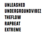


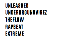
Colour Scheme (Actual)

Hello people as you might remember from last weeks weekly update I said that I'll be creating a colour scheme for my Hip-Hop magazine and I've decided to go with this one. The reason for this is that the colour white and black I think is necessary as most Hip-Hop magazines contain it and also they both contrast well together. As you can see I've also included the colour Pale Silver in my colour scheme as I felt that it's a 'smooth' colour. I also included Red in my colour scheme as when I was looking as it's considered as a Dark and serious colour so by including this it makes it stand out more compared to other magazines. Finally I used the colour Purple in my colour scheme as I feel like it'll be unique as the colour Purple is not generally used in Hip-Hop magazines and also it contrasts well with other colours in my scheme too.
Tuesday, 17 January 2017
Colour Scheme (How I got I ended up with scheme)
Hello everyone today I'll be showing you how I ended up with my final colour scheme. I ended up creating my colour scheme on a website called 'Coolors' and had to go through different stages until I came to my final colour scheme and you can find the stages below with explanations of the colours I decided to keep and get rid off. You'll be able to find my final colour scheme in my next post.


Friday, 6 January 2017
Weekly Update
Hope you're all doing fine as today I'm going to go through my weekly work with all of you guys. This week I've managed to complete my Front Cover, Contents Page and Double Page spread mood board and also I've analysed the front cover of two Hip-Hop magazines. I found the mood board tasks quite interesting as I managed to see different designs that I've liked for the front cover, Contents Page and Double Page spread and it helped me get a rough idea on how I can set my own magazine. Remember if you'll like to see the designs that I have pinned on more detail you can click on the link for them (Front cover, Contents Page and Double page spread). Final task I did this week was to analyse the front cover of two Hip-Hop magazines (As my magazine will be based on Hip-Hop). This benefited me as I looked in depth in different parts of the magazine and was able to spot why the front cover was suitable for a Hip-Hop magazine.
That's all of that for this week but next week I'll be able to show you my Colour Scheme for my magazine and also my Masthead designs so hopefully I'll get to see you all next week!
That's all of that for this week but next week I'll be able to show you my Colour Scheme for my magazine and also my Masthead designs so hopefully I'll get to see you all next week!
Analysis of 2 music magazine of the same genre as mine (Hip-Hop)


As you can see both of the magazines Mastheads have both red and white wether it's on the actual font or background. This is very useful for both Vibe and XXL as it makes their Mastheads stand out which makes it easier for people to recognise as the colour Red and White have a good combination and is suitable for the magazine. In addition to that both of their Mastheads are in Bold which helps the Genre as Hip-Hop is known to be a 'serious' genre by having it in Bold this makes it more appropriate for the magazine.
On both magazines the main image contains someone recognisable in the Hip-Hop genre which is the case for nearly most Hip-Hop magazines. This is beneficial as both Kendrick Lamar and Dr.Dre attracts people to buy the magazine as they're well known in the industry and people who like Hip-Hop would like to get to know them more. Also in both of the images you can see that the artists have a 'bad boy' expressions as they both look serious this like the masthead is very suitable for the Hip-Hop magazine as I've said before Hip-Hop is considered to be serious and by both of the artists looking like a 'bad boy' it links to the genre of the magazine.
Finally as you can see both of the cover-lines on the magazines use the same kind of structure. On both of them they try to make the name of the person on the main image stand out by having their name eye catching to the reader by making the font size large. They both have simplicity on the front cover everything seems to be organised and neat. On both of the magazines the cover-lines are on the right side of the magazine and is a list on what is included in the magazine but nothing that goes into detail which is one of the reasons why the front cover looks neat and simple. Also they've both also ensured that no cover-lines get in the way of the image and as a result have left the bottom half of the front cover empty so the image stand out to the audience.
Wednesday, 4 January 2017
Front Cover Mood Board
My final mood board is based on Front Cover of magazine designs that I like. You can view the images more clearly by clicking the link below.

Subscribe to:
Posts (Atom)